10 Best Prep School and College Websites 2011
Good educational websites share much of the same desirable practices as commercial websites. They need to be user friendly, easily navigable, and use appropriate fonts, colors, and other design elements. Sadly, many schools have decided to take the easy road and duplicate standard layouts and functionality, as if they were all taken from one template…never thinking out of the box. You’d expect the sites to be better than sites for online schools, but some are not! They completely miss the They completely miss the opportunity to make a great first impression.
Below are a list of some of the best school and college websites that get it right. It doesn’t hurt that a bunch of them are art schools.
Neumont University
Good use of white space, simple navigation and interesting take on the Flash Cover Flow floating icons

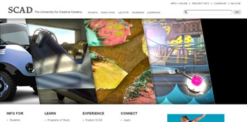
Savannah College of Art and Design
Would anybody expect less from SCAD. Great use of flash on the homepage that seamlessly combines video, images and audio, topping it off, it loads very fast. Go inside to find clean simple pages that are easy to navigate

Solid layout helps control the amount of information and make it not look overwhelming. Flash loads slowly but once its there serves as a nice navigation tool

Phillips Andover Academy
Site has great design touches, good images and concise layout. The background textures give alot of depth to the page.

Latin School of Chicago
Even though I normally don’t like all flash homepages, this site pulls it off. Homepage has great rotating images, easy navigation and good background textures. Once you get inside to the content, the layout is clean, crisp and uses the space well.

Biola Undergrad
Creative design for a school. Good illustrations blended with images. Can never overstate the need for a simple and easy to use navigation.

Fairmount Private Schools
Very clean and open design. Easy to navigate and find the information you are looking for. Overall the site has a very welcoming feeling.

Boston University
Good use of white space, open layout

Ringling College of Art and Design
Site has a wonderful industrial look. An overall intriguing design is enhanced by great background.
Loyola Marymount University
Great use of Flash/Image rotation on homepage. Good use of color. Navigation is great and content is laid out in a clean and clear way, making it very easy to find what you are looking for.


No comments:
Post a Comment